
The wide availability of desktop publishing and photo editing software has put the task of graphic design into the hands of the masses. However, as many professional designers can tell you, there’s a big difference between knowing how to use design software and actually knowing how to apply the principles of design in an effective way.
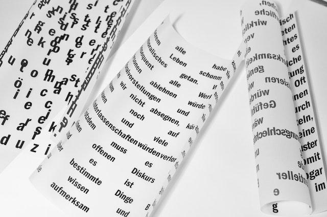
If you want proof of that last statement, just take a look at some of the font choices out there. Type-related ugliness is everywhere! It’s a gruesome thing to behold, and it’s immediately apparent whether the person who designed a particular website or marketing piece was an honest to god graphic designer or just someone with intermediate Photoshop and coding skills. There are, as designer and Thinking With Type author Ellen Lupton would point out, “type crimes” all around us.
If you’re a non-designer using design software, one of the best things you can do to make the pieces you create look better is choose the right font (or fonts) for the job at hand. And to do that, it’s important to know a few basics about type and how it works. We’ve put together this quick primer for you so you can choose the right font (or fonts) every time.
Readability is King
If you have type, whether it’s on a screen or in print, people will want to read it. Your job is to make sure they can! This not only means making sure that you’re using a clean, simple font for a block of text rather than a thick, decorative font, but it also means that your text is displayed correctly. How do your apostrophes look? What about special characters like ampersands? Probably your biggest job when you’re designing something is making sure the text is readable so your information is effectively conveyed. If it hurts your eyes to read, choose another font.
Fonts Send a Message
You don’t have to be a graphic designer to know that fonts add character to a site or piece. Whether you choose one that’s highly decorative or more simple, the font you choose communicates as much as your words do. Make sure it’s sending a consistent message. For example, you wouldn’t use a curly, thin font to market a truck show, or a heavy, all-caps font to market a nail salon. Pay close attention to the character your font adds to your site or marketing piece.
Not All Fonts Play Well Together
For most design projects, just one font isn’t enough — you usually need two. However, not all fonts go well together. Give yourself time to choose fonts that are not only readable and suitable to your message, but that look good together. If you need help with your font blending mission, it’s available! Tools like Web Font Blender and Font Pair are just two of a handful of sites that can help you out.
Cutting Through the Choices
There are, quite literally, tens of thousands of fonts out there. The fact is, anyone with the right software can create a font and make it available for use. However, not everyone can make a good font. If you’re looking for new fonts to download and use, be highly selective; just because you can find it and download it doesn’t mean you should use it. Test to see how it displays type, check it for readability, make sure it sends the right message, and see how well it pairs with other fonts.